L
L
Overview
The Task
The project was completed for the CareerFoundry Intro to UX course over about three months (part-time) and encompassed the research, sketching/low-fi prototyping, and usability testing phases of the design process. I was tasked with designing a mobile flashcard app to assist students with language learning and other relevant topics.
The Solution
Lexicard is an innovative take on the ubiquitous flashcard app with an emphasis on language learning, a topic close to my own heart. This provided me with a foundation in competitive analysis and UX research methods which I would expand upon during my end-to-end design project during the UX Immersion course.
The Process
The scope of the project encompassed the initial research/discovery, early design/ low-fi prototyping, an evaluation based on usability testing, and refinement for future testing.

My Role
As the sole UX designer, I was responsible for research, design and testing. As this project encompassed only the early stages of development, I stuck to paper prototypes, conducting my usability testing using InVision.
Research
Defining the Problem
Though I brought my own relative experience to defining the problem, I wanted to ensure I was designing for my users. I created a list of potential shortcomings of existing solutions to use as a starting point for crafting a problem statement and initial idea for a solution before beginning the research needed to refine it.
Competitive Analysis

The Problem Space
A cursory overview of vocabulary-related apps on the iOS App Store indicates that they can essentially be divided into two basic categories — ones aimed at replacing traditional paper flashcards while providing some additional features, and ones specifically designed to teach foreign languages. Some apps attempt (more or less successfully) to straddle these groups. Pure flashcard apps have the advantage that they can be used to study any subject, and the (possible) disadvantage of lacking pre-made content for users to study. Language learning apps, on the other hand, often provide a wealth of ready-to-learn material, but may limit the level of customization that users can exercise over it and their ability to add their own. While very specific users may benefit from an app that teaches a particular subject, apps that put the user in charge of what words they wish to study and strive to provide them with the best review experience possible are more versatile. Some of the apps I explored including Quizlet, which I analyzed in more detail below give users the option to easily choose from studying pre-created materials or to create their own. For this reason it will be essential to have the intended users in mind when making design decisions. In the end, user research will be necessary to determine what exactly my users are looking for.

Quizlet
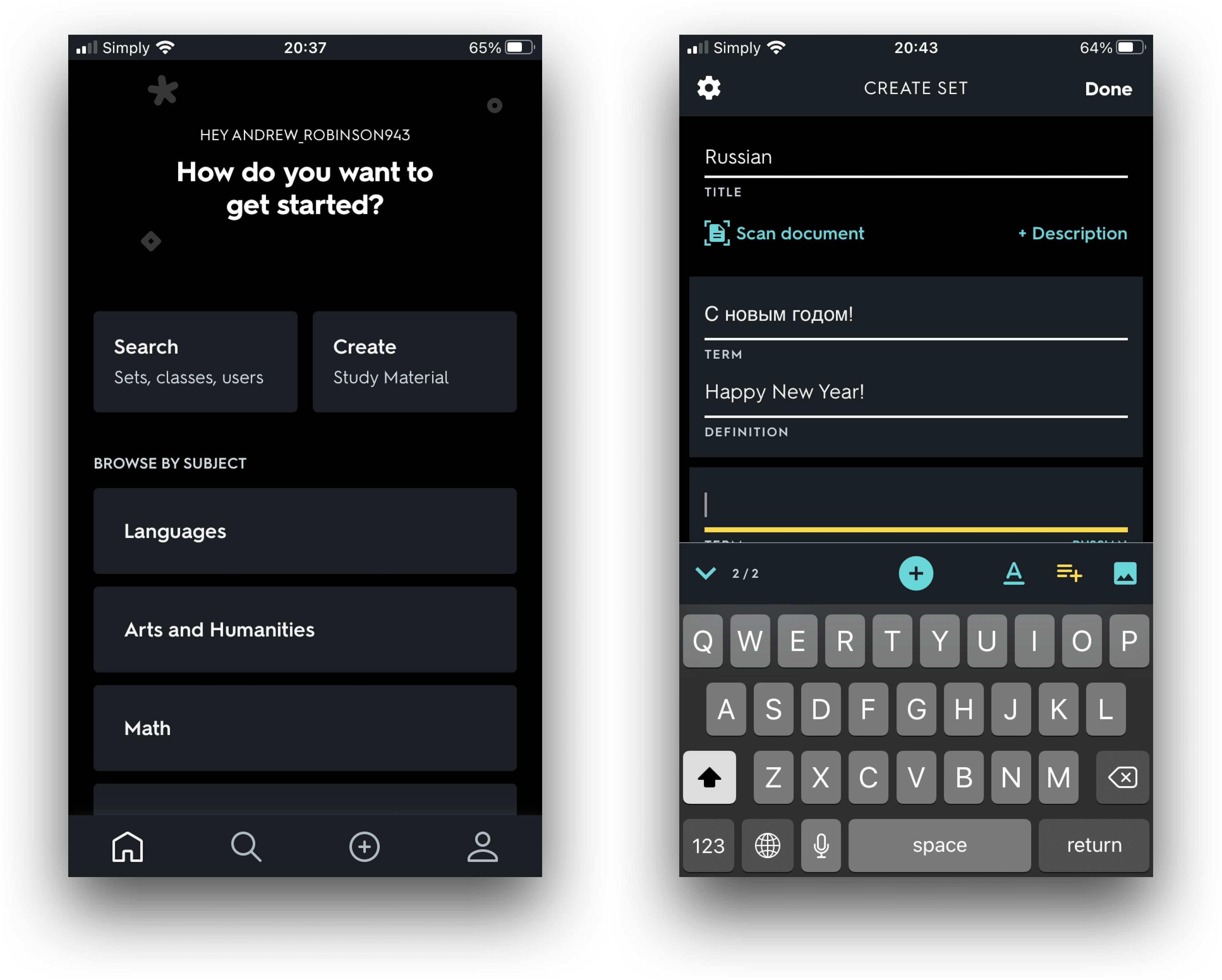
Overview
Quizlet is a popular app for creating and studying sets of flashcards which boasts an impressive 50 million users per month according to its page on the App Store. It offers students the ability to review vocabulary with a variety of different study modes, and premium users can add pictures and audio files to their cards. Quizlet is also available as a web app meaning that users can study from a desktop browser or using the mobile app.
Launch Experience and Onboarding
👎 Launch Experience is a bit cumbersome, with the user not only being asked to register an account and provide personal information, but then being prompted to sign up for the pro version without any onboarding or ability to test the free version beforehand.

If the user follows the prompt for the free seven day trial, they are required to sign up for a subscription that will automatically charge them when the trial expires. This could be off-putting to some users.
Home Screen and Navigation
👍 Menu navigation is intuitive with a standard horizontal menu at the bottom and conveniently spaced cards.
When the user reaches the home screen, they are greeted with two large buttons, one labeled “Search” with the subheading Sets, classes, users, and the other labeled “Create” with the subheading “Study Material” This does a good job indicating that users can either study existing material, or create their own.
👎 However, it is unclear what exactly is meant by the subheadings, for example, what are sets, classes, and users? Does “Study Material” just mean flashcards?
Features and Ease of Use
👍 Users can browse a library of decks as well as create their own.
👍 UI elements do not distract from the content
👍 Supports different types of media including images and audio files, although this requires the premium version which may exclude some users.
👍 When typing a new vocabulary item, Quizlet will suggest a translation (the user must predetermine language pair of the card)
👍 Multiple review options including “learn” in which the user is prompted to type the word, as well as “Flashcards” which mimic traditional paper flashcards
👍 Intuitive controls during study sessions: the user is prompted to swipe right for correct answers and left for incorrect ones.

Summary
The Good
👍 Clean, minimalist UI that allows users to focus on content
👍 Flexibility to study existing or create custom flashcards
👍 Supports different types of media including images and audio files
👍 Multiple review modes to support different learning styles
👍 Intuitive menus and navigation on the Home Screen inside the review modes
👍 Desktop version (web app) allows users to study using a computer or mobile device
The Bad
👎 Slightly cumbersome launch experience
👎 Very little onboarding
👎 Button text is not always clear
👎 Quality of pre-made study content varies widely as it is community contributed
👎 Could be greatly improved with the addition of a Spaced Repetition System (SRS) which would keep track of users’ review sessions and prompt them on when and which cards to study.
Success
Quizlet sets out to provide users an easy way to create, save, and review flashcards. It accomplishes this goal and provides users with a reasonable amount of customisability without making the app overcomplicated. The app is easy to use and sports a clean and attractive UI. That said, it feels more like a companion app to the web app, which boasts more features. A major deficiency, is the lack of an SRS to help users remember what they study over a longer period of time.

AnkiMobile
Overview
Anki is an application for creating simple or multi-media flashcards built on a robust spaced repetition system. Anki sets out to offer users the ability to remember anything and is especially aimed at those looking to learn a language or study for exams, and its main selling points are its flexibility, giving users the option to create media-rich cards, its customizability, offering an extensive library of user-created plugins, and its SRS system.
Launch Experience and Onboarding
👍 Anki launches quickly and takes the user directly to the Home Screen
👎 Onboarding is severely lacking for an app with so many settings. Users are simply asked to click the “?” In the top left which then takes them outside of the app to a website with a long user manual
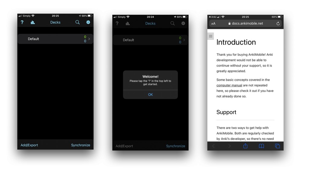
Home Screen and Navigation
👍 Menu items are easily visible and intuitive.
👎 When creating a new deck, users are first greeted with a screen telling them they have finished the deck for now. They must then click the “Add” button at the top of the screen. A better option would be a message telling the user that the current deck is empty.
👎 Deck and card creation are relatively straightforward, however the user must figure out what the various “Note Types” mean and know which one best suits his/her study material, which could be confusing to some users. This could be effectively remedied with some better onboarding.

Features and Ease of Use
👍 Minimalistic UI that allows users to focus on the content they are studying.
👎 Default font size seems a bit small, this could pose an obstacle for some users.
👍 Users are provided with a variety of formatting options and the ability to add multi-media files when creating cards.
👍 Several card types are supported including Cloze and Typing tests. These may be suitable for more advanced users, while users with more basic needs can stick with the “Basic” card type.
👍 Intuitive controls: tap to reveal answer, evaluate with “Again”, “Good”, or “Easy” (for the SRS). Buttons are color-coded to help users avoid tapping the wrong one.
👍 Provides extensive statistics for users who are interested. These can be accessed by tapping the bar-graph icon on the Home Screen.
👍 The Preferences menu is well organized by category and easily discoverable and accessible on the Home Screen by tapping on the gear icon.

Summary
The Good
👍 Minimalist UI design that avoids distracting elements
👍 Spaced repetition system that guides users on when cards should be reviewed for optimal retention
👍 Clearly visible and intuitive menu items
👍 Straightforward card creation with a variety of formatting options provided
👍 Support for images and audio files
👍 Provides usage statistics for advanced users
👍 Offers a desktop version and synchronization between mobile and desktop apps
The Bad
👎 Insufficient onboarding. It is not clear to the first-time user what all of the settings do, and the user is directed outside of the app to the website to read a long instruction manual.
👎 Many settings feel too complicated or unnecessary for all but the most advanced users
👎 While the desktop version is free and open source (a definite 👍 for some users) the iOS app comes with an obscenely hefty $25 price tag. In addition to this, there is no free trial version. This has the potential to discourage users who are not already familiar with the desktop version from downloading the app.
Success
Anki sets out to provide users with a versatile and highly customizable flashcard app built on the science of spaced repetition. The AnkiMobile Flashcards app meets these goals, and provides its users with a wealth of features and the ability to create study material customized to fit their individual needs. In doing this however, it does not cater to the many potential users who may value ease of use over customization, and sets first-time users before a steep learning curve that is not present when picking up similar apps. Perhaps a perfect choice for a small subset of flashcard users, but one with many unnecessary features for most.
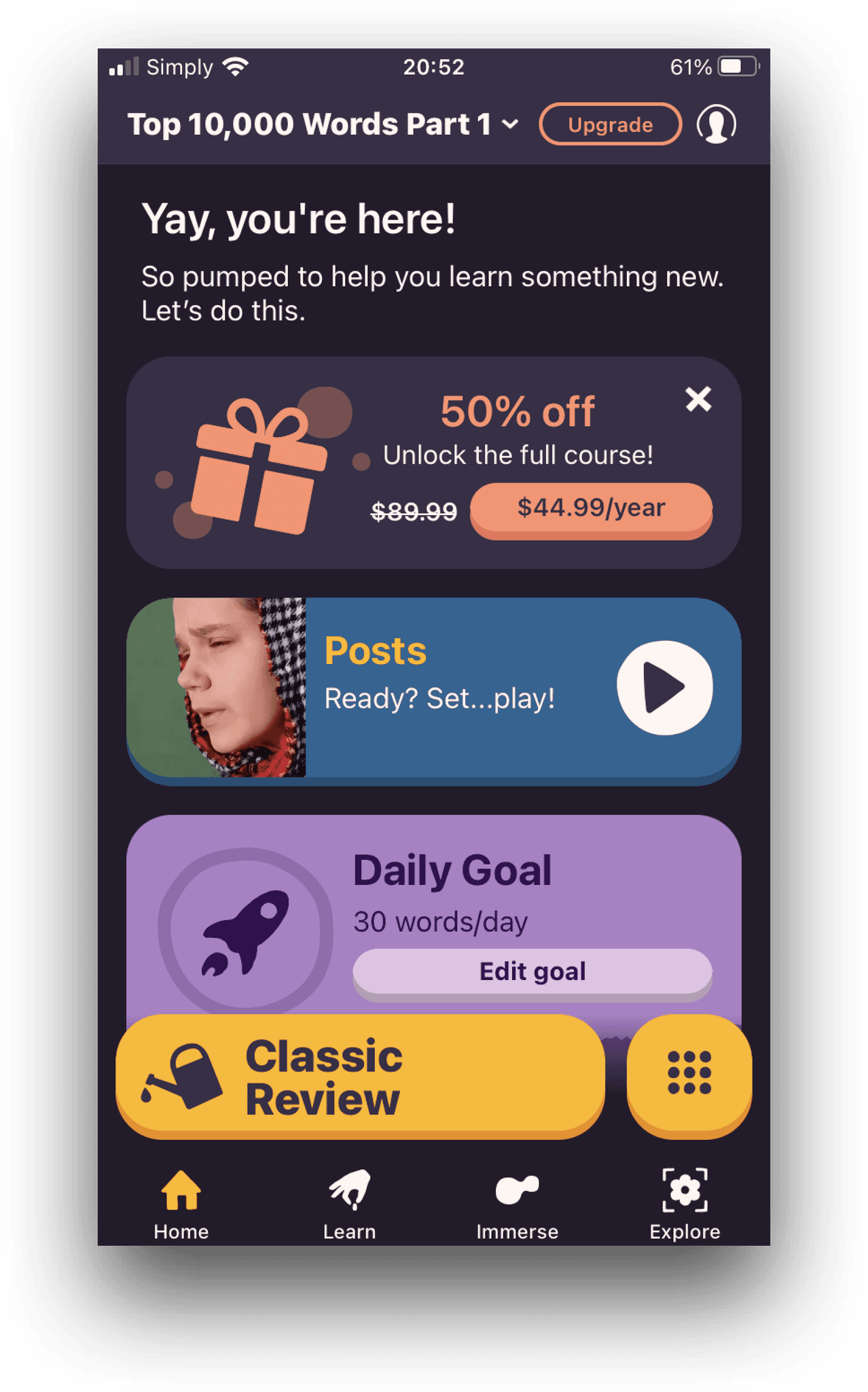
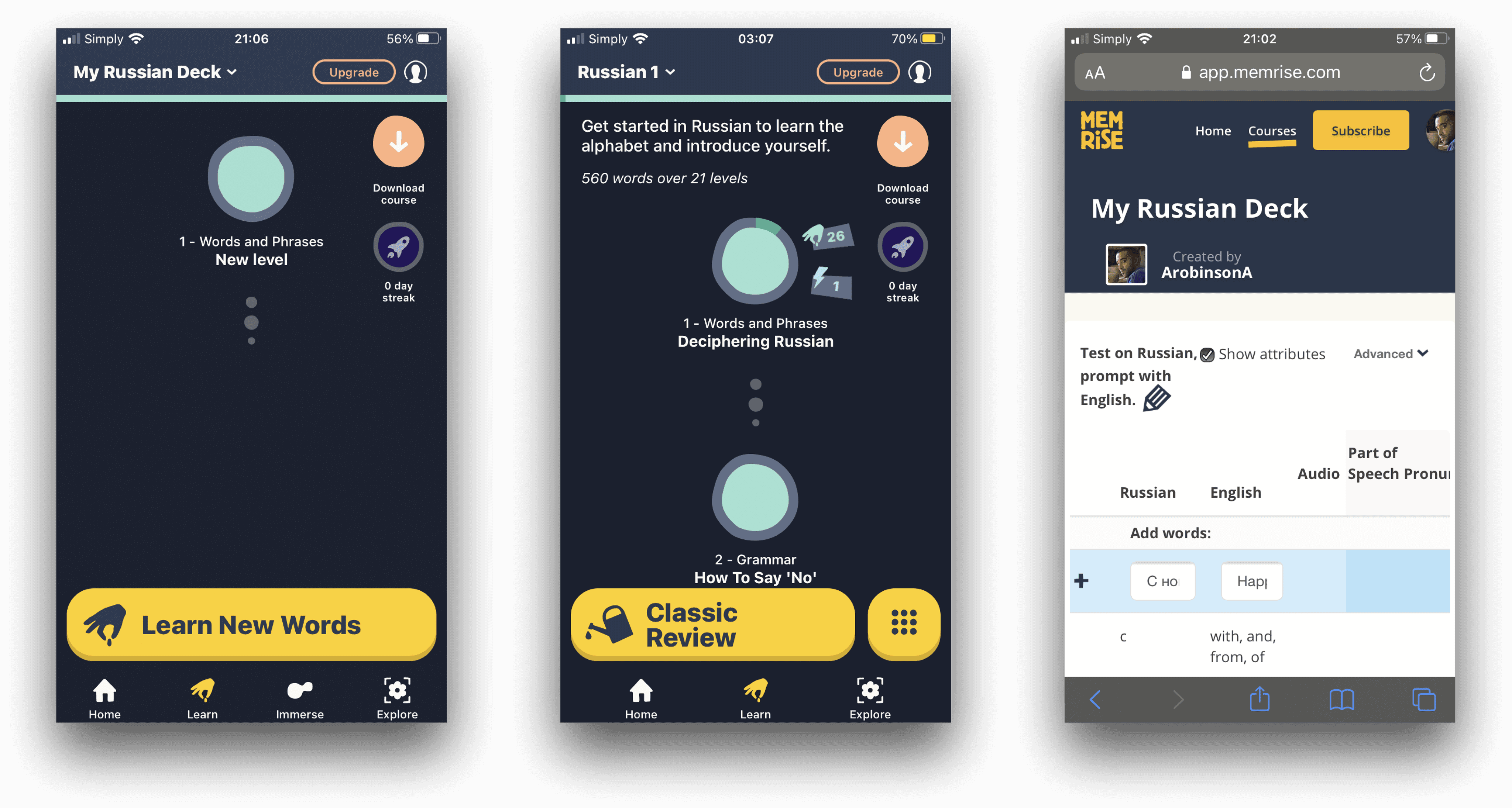
Memrise
Overview
Memrise is a popular flashcard-based language learning app that utilises spaced repetition to help users remember words and phrases a foreign language. It incorporates a variety of different exercises into its study sessions and offers users bite-sized review sessions of a few minutes. Memrise offers pre-built language courses (essentially decks of flash cards) meaning that users do not have to add their own words. Learners can browse videos of native speakers to practice their comprehension as well. Memrise is also available online as a web app for use on computers.
Launch Experience
👍User is prompted to select their desired language on launch rather than after registration. This is good, as the user can see if their desired language is available without having to register an account first.
👍 User is given the option to choose between “Beginner” and “Intermediate”. This allows users who have studied the language before to jump ahead of potentially redundant material saving them time and frustration.
👎 After registration, the user is greeted with a screen prompting them to sign up for a subscription, although it is not made clear what the benefits of a subscription over the free version are. Perhaps it would make more sense to first provide the user with some onboarding and introduce the core features of the app.

Home Screen and Navigation
👎 When finally arriving at the Home Screen, the user is greeted with several tiles, the top one being yet another prompt to purchase the premium version.
👎 The Home Screen feels cluttered with too many elements. There are three different button designs, the bottom horizontal menu items, the cards down the middle of the screen and the yellow 3D buttons above the horizontal menu. In addition to this, the user has to scroll to read all of the cards which is completely unnecessary given that the cards could be made much smaller.
👎 It is unclear from the options visible on the menu how to access and change the settings. This could be a source of frustration for users.
Features and Ease of Use
👍 Navigation within the lessons is intuitive, users tap on cards and are shown letter tiles when expected to type.
👍 Several different types of tests as well as videos of native speakers help keep the user engaged.
👍 The “Immerse” mode features short videos with subtitles for users to get exposure to the spoken language.
👎 Seeing all of the words/cards in the curriculum is overcomplicated, as the user is required to search inside of each separate lesson indicated by a circle on a vertical scroll menu.
👎 UI elements are distracting and detract from ease of navigation. For example, the horizontal menu at the bottom of the screen indicates to users that they can select four different screens (Home, Learn, Immerse, and Explore). This makes the very large “Learn New Words” button located directly above it completely redundant (it is only clear upon further inspection that the “Learn” menu item and “Learn New Words” have exactly the same function.
👎 Creating custom decks is not possible inside of the mobile app and can only be done with the web app version which does not work well on mobile devices. This means that mobile users are limited to studying the vocabulary provided, and can not use Memrise to study their own cards or a subject other than a foreign language.

User Interviews and Affinity Mapping
After completing my competitive analysis, I was ready to move on to user interviews. I carefully crafted my interview questions to both get an idea of the participant's overall profile and then focus in on potential points of friction they experience when trying to study vocabulary. I took careful notes during each interview which I later distilled into concrete needs and preferences.
Interview Script
Hi, [name], my name is Andrew, and I'll be interviewing you today. First of all, thank you very much for agreeing to participate in my research. I'm conducting interviews to get a better understanding of how people approach learning vocabulary in subjects such as foreign languages. This session should not take more than 15 to 20 minutes of your time. I want to make it clear that you are not being tested. There are no right or wrong answers, which means there is absolutely no need to worry about making mistakes. Any information you choose to share with me is valuable. Please feel free to ask any questions you may have as we go along, and if you would like to take a break at any point, just let me know. Do you have any questions before we get started? Excellent, let's get started! I'm going to ask you a few questions for a project I'm working on about learning vocabulary.
Interview Questions
Tell me about yourself.
What does your average day look like?
How would you describe your relationship with technology?
When was the last time you had to learn new vocabulary?
What learning strategies did you employ? Were they successful?
What was difficult or easy about learning new vocabulary?
How do you/have you scheduled your study time in the past?
What are/were your goals in learning new vocabulary?
Have you ever used an app to help you learn new vocabulary? And if so, which apps have you used?
What do you like about the vocabulary apps you are using or have used in the past, and what don’t/didn’t you like?
What kinds of features would you find especially useful in an app for learning vocabulary?
How much time do you(/would you) devote to practicing your vocabulary each day?
Affinity Mapping of Quotes
I went through my notes, collecting quotes and created an affinity map sorting them into "Doing", "Thinking", and "Feeling" categories. This helped me understand commonalities between my users which could later be translated into actionable design decisions.

User Persona
The scope of the project allowed for the creation of a single "proto-persona". As the goal of persona creation is to guide design decisions while keeping the end user in mind, it made sense to incorporate the most salient attributes, attitudes and painpoints uncovered in my interviews.

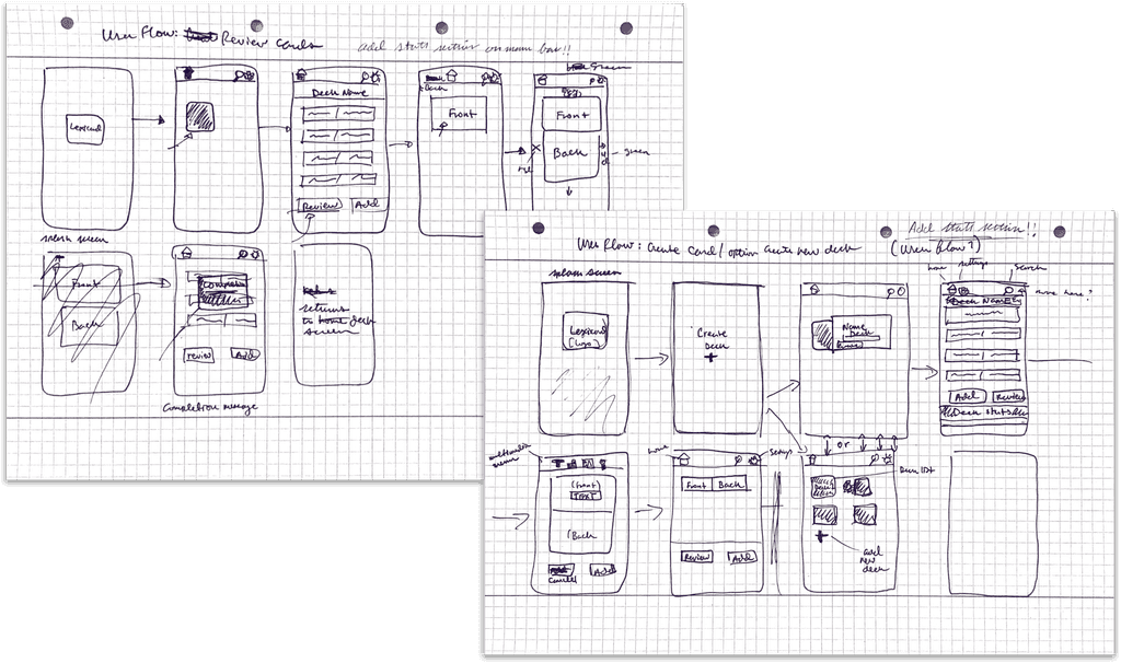
Task Analysis / User Flows
I conducted a task analysis to conceptualize the steps my users would take as they tried to accomplish several main goals. I then created task flow diagrams to better visualize user journeys. I focused on card creation and review as these two areas represent the main functionality of the app.


Design
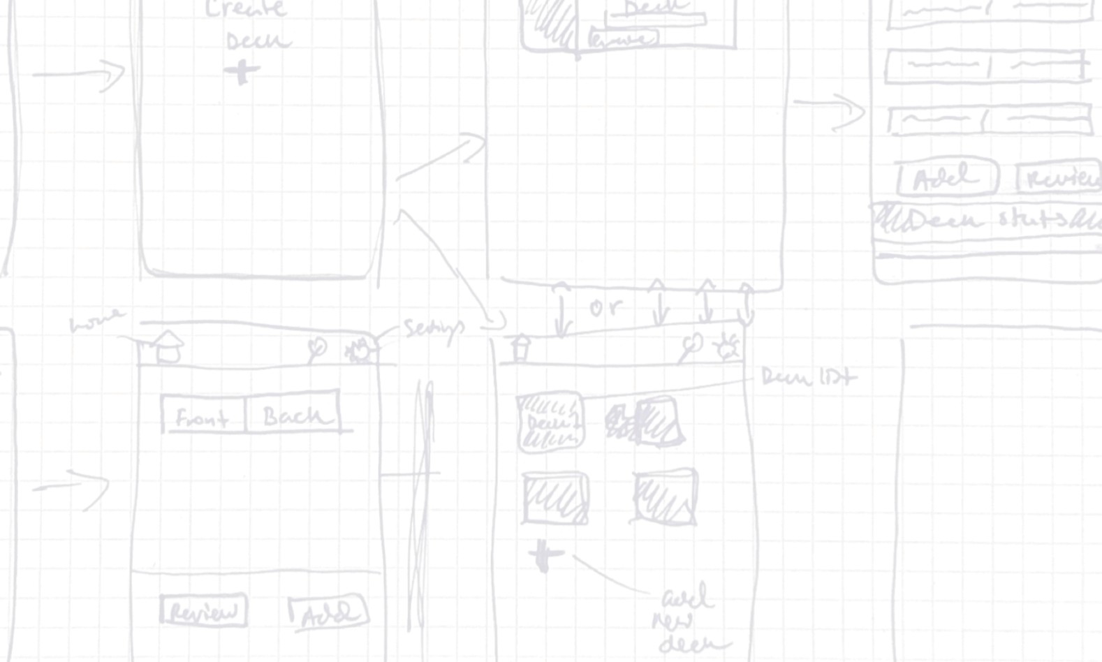
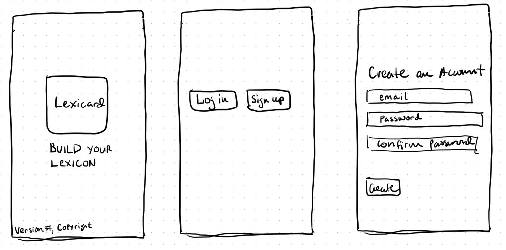
Using my persona, task flows and user flows to guide me, I began to sketch the app's interface. My goal here was to get a rough clickable prototype out for usability testing. I mapped out the sign-up and onboarding flows and sketched screens for these as well as the card creation and review flows, as I wanted to test all of these with users.
Sign up Screens
Onboarding Screens

Card Creation Screens

Card Review Screens

Usability Testing
Methodology
I conducted moderated online usability testing with four participants, making use of Invision to create a prototype from my low-fidelity wireframes. I took careful notes during each testing session and compiled my findings into a report in which I evaluated the efficacy of the design in relation to each participants ability to complete each task. I evaluated the severity of errors using the Nielsen severity rating scale. Finally, I made changes to the prototype to address issues that came up during the testing.
Tasks
Create an account
Create a Flashcard Deck
Create a Flashcard
Review flashcards
Test Results
Test 1

Test 2

Test 3

Test 4

Error Evaluation

Prototype Changes

Conclusion
Learnings
Thank you for taking the time to read my case study! Though this project was limited to initial research, wireframing and usability testing with low-fidelity prototypes, I was able to learn several important lessons that would aid me as I tackled my next project, which encompassed the entire end-to-end design process.
It is best to conduct usability tests with people who are as similar to the user personas as possible. The feedback from the tests isn’t as helpful if the users who test it aren’t the intended users. Finding participants who would actually use the app makes the tests more realistic and leads to better insights
Sometimes it’s better to stick to already established design conventions rather than try to come up with something completely new. If something has been done well in many other apps it makes sense to build on user’s preexisting knowledge rather than making them learn something new.
It’s important not to get too set on early design ideas, as they must be change based on the feedback of actual users. It’s easy to make assumptions about how people will interact with the prototype, but these are not always borne out by actual testing. At the end of the day it is the User’s experience that matters, not the designer’s subjective opinion.
Next Steps
While the scope of the project didn't allow me time for further development, I would take the following next steps if I were to continue the project.
Conduct further usability tests to test changes implemented after the first round
Create higher fidelity prototypes to better assess usability
Conduct tests for different tasks and repeat the test cycle to work out any issues