
Overview
The Problem
Moving abroad is huge. Today, more people live outside the country in which they were born than ever before. Some do so by choice, others, out of necessity, and most face challenges when they arrive in their new home.
The Solution
Expat Answers is a responsive web app aiming to provide expats or prospective expats with peace of mind and facilitate their adjustment to life in a new country by connecting them with qualified experts on visas, housing, taxes, and other relevant areas that often pose a challenge. The project, completed as part of CareerFoundry’s UX Immersion course, was inspired by my own experience as a foreigner living in Germany for almost four years.
The Process
I took an iterative approach consisting of four main phases. I began with understanding the problem space and defining the problem before moving onto ideation and evaluation. I made revisions to the foundational design based on feedback before moving onto the delivery phase, where I refined the UI, and built a style guide.

My Role
As the sole UX designer, I was responsible for all research, design testing and documentation. I used a variety of tools including Google Forms, Usability Hub, Optimal Sort, pencil and paper, and Figma.
Research


Defining the Problem
Though I brought my own relative experience to defining the problem, I wanted to ensure I was designing for my users. I created a list of potential shortcomings of existing solutions to use as a starting point for crafting a problem statement and initial idea for a solution before beginning the research needed to refine it.
Potential Problems
- Most guides are aimed at tourists rather than expats. Our users have different needs
- Finding existing information (especially in the user’s native language) is difficult and time-consuming because users have very individual questions and the information is often spread across many different sites.
- Existing expat apps may have information that isn’t specific enough for some users.
Problem Statement
“Our users need a way to find accurate, comprehensive answers to their questions about life abroad because they waste time searching for answers and want personalized advice tailored to their situation. We will know this to be true when we see that our users get the answers they want, through user feedback.”
Competitive Analysis
I conducted a comprehensive competitive analysis of the two of the most compelling existing solutions for expats, the findings of which are summarized below.


The Problem Space
When it comes to “expat” apps and websites, there currently seem to be two main categories. The first is aimed at connecting expats with each other, essentially creating a social network. The second provides advise on specific topics related to expat life, sometimes even offering consultations, but focuses solely on one or several specific fields such as Taxes or Banking. All smartphone apps researched belong to the first category, meaning that they had little relevance to the project and therefore weren’t considered in the analysis.
Expat.com
“Make your expat project a success! Discover the largest expat help and support network. Whether you are about to relocate or already living in your host country, expat.com helps you throughout your project”
Overall Strategy
Expat.com provides information and affiliate links to various services that may be helpful to their users, such as Babbel (language learning) and HSBC (banking). They encourage users to write about their abroad experiences and feature user-contributed articles on the blog. Users can create a profile and connect with others similar to social networking sites. There is currently no mobile app and the website doesn’t seem to be optimized for mobile devices.
Marketing Profile
Expat.com seems to be well established in the online expat community, as it consistently appears in Google searches and maintains a Facebook page with over 111,000 subscribers. The site has more than 2.4 million registered users and is visited by over 100,000 people per day according to its LinkedIn page.
What could I do differently?
Expat.com offers users an unmatched number of articles, links and blog posts on many different topics, but the navigation structure and the consistency of content provided could be greatly improved. This presents a potential opportunity to focus on high quality resources across a more focused range of topics. Additionally, expert advice given to users in real time could greatly improve their experience by answering any specific questions more efficiently.
Experts for Expats
“We’ll connect you with advice you can trust, helping you make the best choices when it comes to your finances and your future. Your request is always dealt with personally. That means you’ll receive tailored advice and support from your first contact.”
Overall Strategy
Since its inception in 2012, the company has built an extensive network of expert consultants and advisers across a range of industries including tax, pensions, investments, insurance, and international mortgages. According to the company’s ad agency, their revenue is mainly generated through commissions based on closed/won business by their partners.
Marketing Profile
Experts for Expats is committed to winning more customers and has recently been able to increase its turnover from 10% to almost 20% by implementing new marketing strategies, including improvements to website copy and a targeted blogging campaign, which has had a positive impact on their brand visibility in search engine results. The company maintains a social media presence with a Facebook page which has garnered 1,740 subscribers. They could, however be far more active, as currently the latest post is from 2019.
What could I do differently?
There is a limited amount of information on the site, as it is mainly a service for connecting with experts. Unfortunately, the expert list isn’t very comprehensive and seems to include experts in a narrow range of fields related to taxes and financial planning. This presents the opportunity to offer a wider array of services. Users could also be connected directly with experts rather than referred to them. Additionally, the Company seems to be focusing on citizens of the UK, meaning there is an opportunity to serve customers in from other countries.
Conclusion
It is certainly possible to offer users an application that provides them with a service currently unavailable on the market. The competition is limited to niche fields of expert advice or resources for broad generalized information. The key is an intuitive user experience that ensures that users of all ages are able to find and book consultations with the experts that are best able to assist them.
Research Plan
After analyzing the competition, I planned and conducted user research to help better define the problem I needed to solve. I began by conducting a short survey before moving on to interviewing users. I took detailed notes during my interviews and used affinity mapping to provide insight into actionable design decisions. I created research-based user personas to facilitate empathy and understanding of my users’ needs. Finally, I mapped out common task flows and user journeys to help with the design of the site’s architecture.
Research Goals
- Identify the most prevalent everyday problems faced by potential users
- Understand where my users have previously or are currently obtaining information
- Gain insight into my users’ backgrounds and level of experience abroad
Research Methods and Analysis
- Survey with Google Forms
- User Interviews
- Affinity Mapping (analysis)
- User Flow Diagraming (analysis)
Survey Insights
Respondents shared a variety of expat experiences in and from a wide range of countries. The sample size was quite small (only 15 participants) and was limited to the Slack group, meaning that the insight I can gain from it is rather limited.
🇺🇸🇮🇱🇸🇪🇦🇺🇲🇽🇩🇪🇪🇸🇮🇹🇬🇧🇳🇱🇫🇷🇮🇳🇨🇦🇹🇼🇨🇭🇮🇩🇧🇬🇧🇴🇵🇱🇰🇷
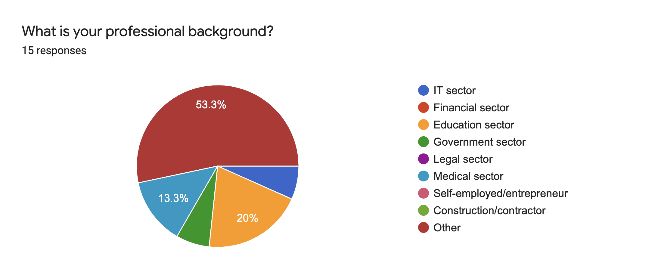
The majority of participants (70%) are between the ages of 26 and 35. This might be a biased sample as these responses were taken from the CareerFoundry Slack group, which likely has this demographic overrepresented. The participants came from a wide variety of professional backgrounds.

Around 27% of respondents had no knowledge of the language spoken in their new country before moving. This would indicate that language-related services would be helpful to a significant number of users, especially given that this number only represents those with no previous knowledge.

The majority of users (60%) moved for family/relationship reasons, followed by those who moved for career reasons. An equal number moved for adventure and to study. This suggests that a variety of different services should be offered, from recreation, to career advice.

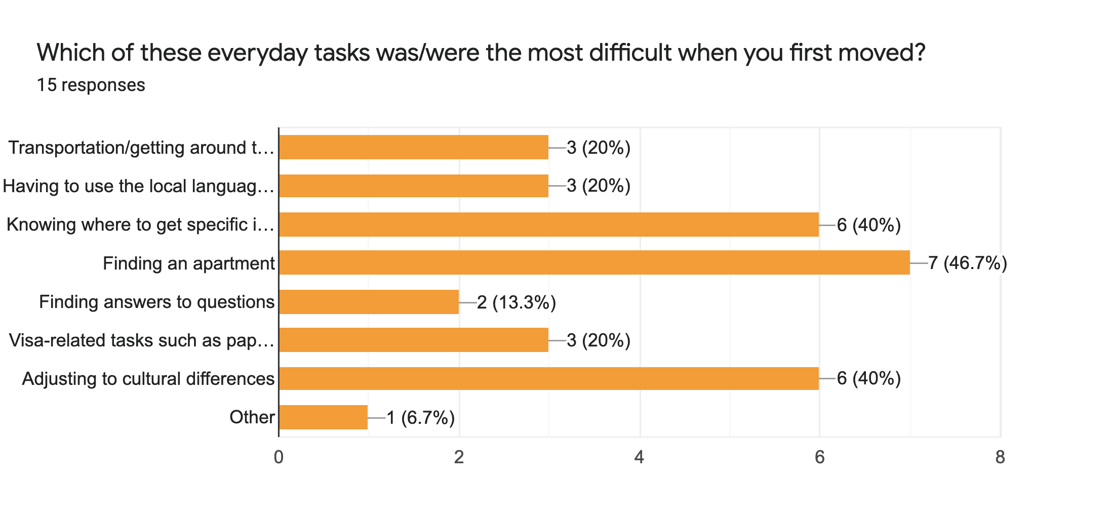
When it comes to tasks that were the most difficult, finding an apartment ranked the highest. Adjusting to cultural differences and knowing where to buy specific items came in next. This provides a clue as to the services/areas of expertise that should be covered.
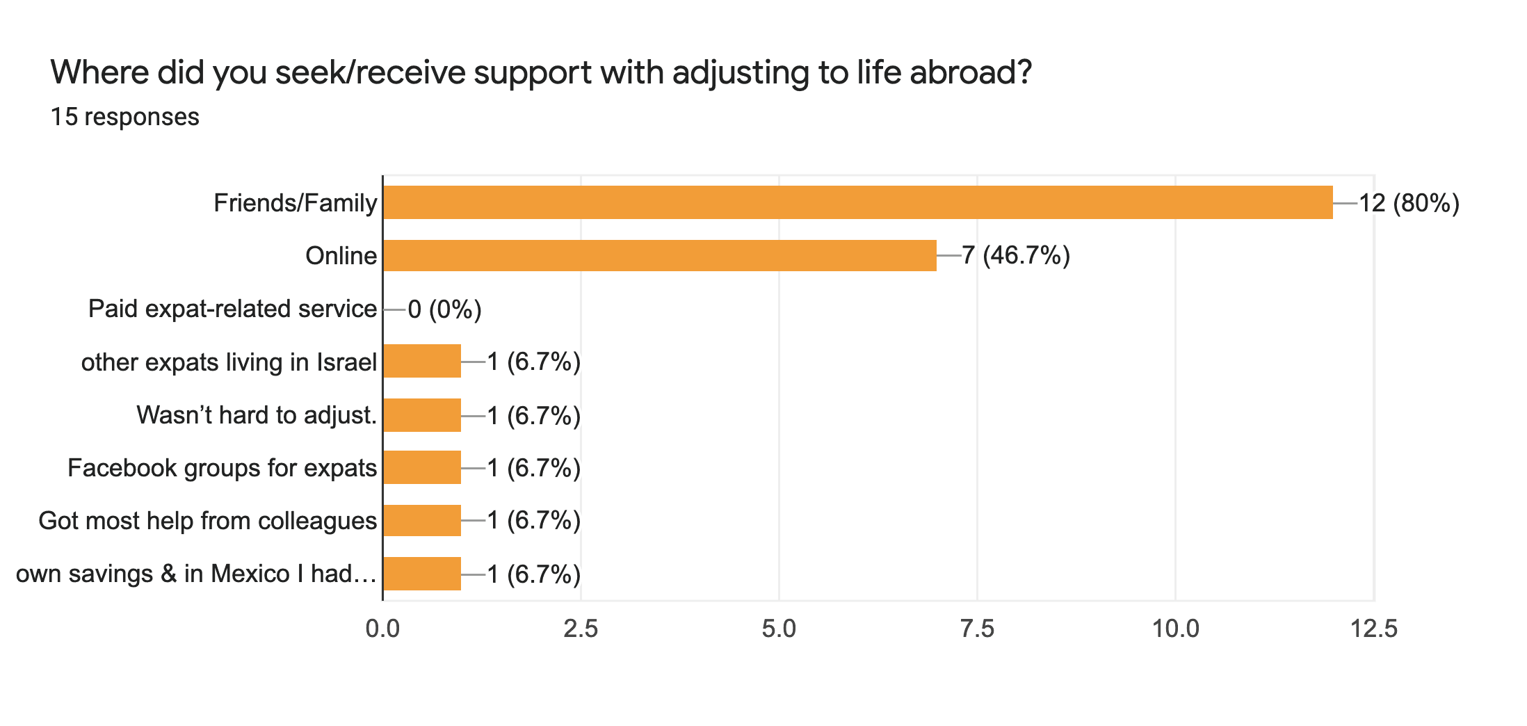
The majority of the respondents (80%) sought and/or received help adjusting to life abroad from their family or friends, while around 47% percent looked online. Interestingly, none of those surveyed reported using a paid expat service. While this could indicate that new expats are unlikely to pay for a service of this kind, it is also possible that their behavior is a result of the fact that a service of this kind doesn’t currently exist.
User Interviews and Affinity Mapping
I conducted interviews with three expats to gain insight into any pain points they encountered when first moving abroad. To better understand the data, I summarized my key findings for affinity mapping, first sorting findings into three categories: Behaviors/Attitudes, Pain points, and Needs and Goals, and then identifying key themes across participants responses, which turned out to be Housing, Information, Services, and Features.

Interview Questions
How long have you/did you live abroad?
Which country are you from and which country did you move to?
Why did you decide to move abroad?
What is your professional background?
How would you rank the difficulty of adjusting to life in your new country on a scale of one to ten, one being “very easy” and ten being “very difficult”?
Did you speak the language spoken in your new country before moving there? If not, did you ever learn it?
Did you do any research before moving? If so, how?
Did you use any expat-related services? If so, which ones?
What did you like about any of the services you used? What did you dislike?
What (if any) everyday tasks were difficult for you in your new country?
Was there anything you found easy about adjusting to your new country?
How did it feel to be new in a new place?
Is there anything you wish you had known before moving?


Emotional
Participants were generally enthusiastic when talking about their experiences abroad, but they also expressed the expectation that there would always be stress and problems to solve, and that they often could have made different decisions at the beginning.
Social
Participants’ accounts carried when it came to their social life in their new countries. While one found it especially difficult because she didn’t speak the language, another seemed to have had no trouble adjusting and making new friends. All participants relied heavily on their social network, whether online or otherwise to provide them with advice and support during their journey.

Housing
Participants reported that finding accommodation was especially problematic, and all three interviewees felt that they didn’t get the best deal on their first apartment. This could be a key area in which to provide expert advice.
Information
According to both the survey and the interviews, our users often get information online, especially favoring forums and Facebook groups. This indicates that having a social media presence on which to post articles on expat-related topics, which could be shared across such forms or groups, could be an especially effective means of attracting new users to our service.

Services
While participants didn’t mention any comprehensive service that could met all (or even most of) their needs, some used a service to help them complete their visa application, and one used a service to find him an apartment. These services were regarded as being overpriced and one interviewee mentioned that she had less than satisfactory experience with the customer service team. Many of the pain points exposed by the interviews are centred on areas such as banking, health insurance, and visa-related services. Transportation and taxes were also mentioned. To address these issues, our app could provide users with expert advice on these topics and help them make informed decisions.
Features (based on needs)
The findings gleaned from the survey and interviews indicate that several key subject areas should be included. These are accommodation, banking, insurance, visa, and culture. Additionally, the site should be organized so that all potential areas of interest are clearly visible and users can quickly understand where they can have each of their questions answered.
Summary
All participants described frustration in similar situations that arose shortly after arrival to their new countries, for example, setting up a bank account and finding an apartment were mentioned across the board. One participant mentioned the difficulty he had in figuring out which stores were the best for which items, and how the transportation system worked. Another mentioned the significant time she’d spent researching which mobile carrier would be the best value. None of the interviewees had used a comprehensive service to answer their questions but had either asked other expats or searched for answers in online forums. When describing this method, they expressed varying levels of dissatisfaction with the quality of the information they’d received and the ease of obtaining it.
User Personas


I used the data gathered in my user interviews to construct personas to represent a range of user groups who would constitute my users. Each persona is complete with background information, everyday activities, device usage, goals/needs, and motivations/frustrations.


User Journeys


Task Flows and User Flows
Next, I designed task flows to better understand exactly how my users will navigate the app. These helped me gain a preliminary understanding of the site’s structure and an idea of which pages I will have to build. These were turned into user flows to better visualize the user’s navigation through the site.


Foundational Design
Architecture
Initial
Updated
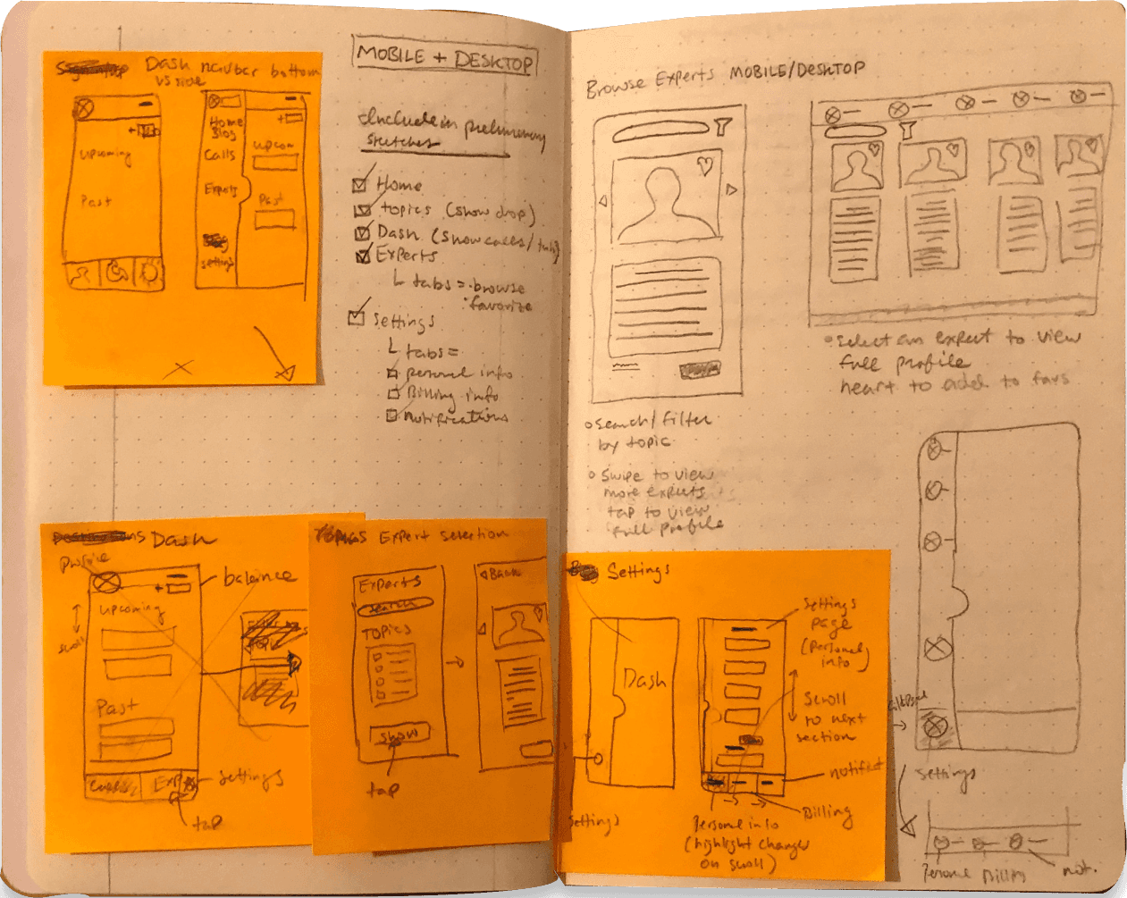
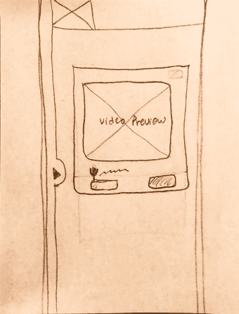
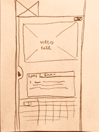
Sketching and Low-fidelity Wireframes
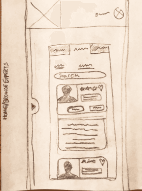


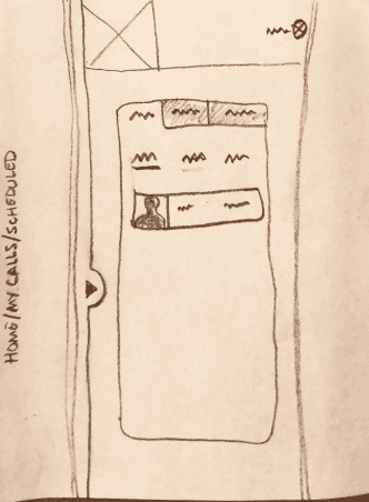
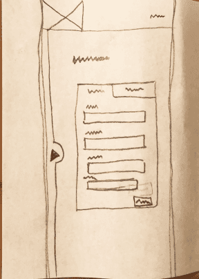
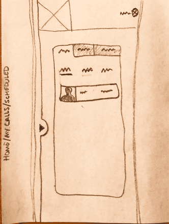


Mid-fidelity Wireframes
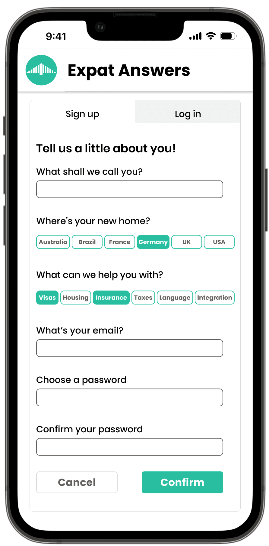
Sign Up Flow

Book Call Flow


First Prototype
Sign Up Flow
Book call Flow


Evaluation
Test Plan
I conducted moderated remote usability testing with 6 participants in February 2022 via Zoom due to health concerns regarding the ongoing Covid 19 pandemic. Participants were selected based on their similarity to the target audience and contacted via email with the details of the testing and given a consent form allowing me to record the sessions for further analysis.
Scope and Methodology
The goal of the testing was to assess the overall efficacy of the design, with specific focus on learnability for users unfamiliar with similar services. The tests were aimed at providing vital insight into user understanding of the main navigation, as well as uncovering any areas of confusion that arose when attempting to complete tasks related to the basic functionality of the app, such as account creation, expert search, and call scheduling and initialization.
Tasks
How long have you/did you live abroad?
1. You've decided you'd like to create an account to try out the service. Go ahead and try to accomplish this task.
2. Now you'd like to find an expert who can answer your questions about work visas. Browse through the available experts and try to book a call.
3. You've scheduled an appointment with an expert and you're ready to join the video call. Go ahead and try to join. (Start this task from the dashboard, as if the user had just signed in)
4. You'd like to browse the blog articles available on the site. Try to navigate to the blog section and choose an article. (Start this task from the dashboard as well)
5. Now navigate back to your account page. (Don't use the word "dashboard" as we want to see if users can understand this concept without the hint)
Bonus: Try to add credit to your account balance.
Metrics
Design efficacy was evaluated based on user error during testing. The Severity Ratings for Usability Problems scale developed by Jakob Nielson was used to categorize errors as follows:
0 = I don’t agree that this is a usability problem at all
1 = Cosmetic problem only: need not be fixed unless extra time is available
2 = Minor usability problem: low priority
3 = Major usability problem: high priority
4 = Usability catastrophe: imperative to fix before release
Affinity Mapping
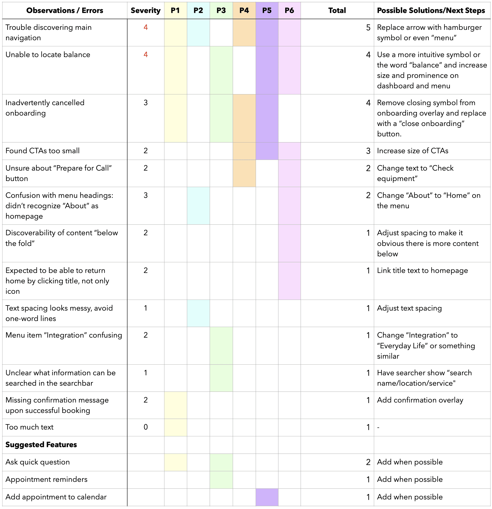
I recorded all test sessions and subsequently took notes on participant behavior, observations, positive and negative quotes, as well as errors made during the testing. I then organized these insights into an affinity map to better understand the relationship between them and uncover patterns. I consolidated the findings from my comprehensive map into a simplified version, highlighting common issues that surfaced during the testing. The maps can be viewed in detail at the links below.
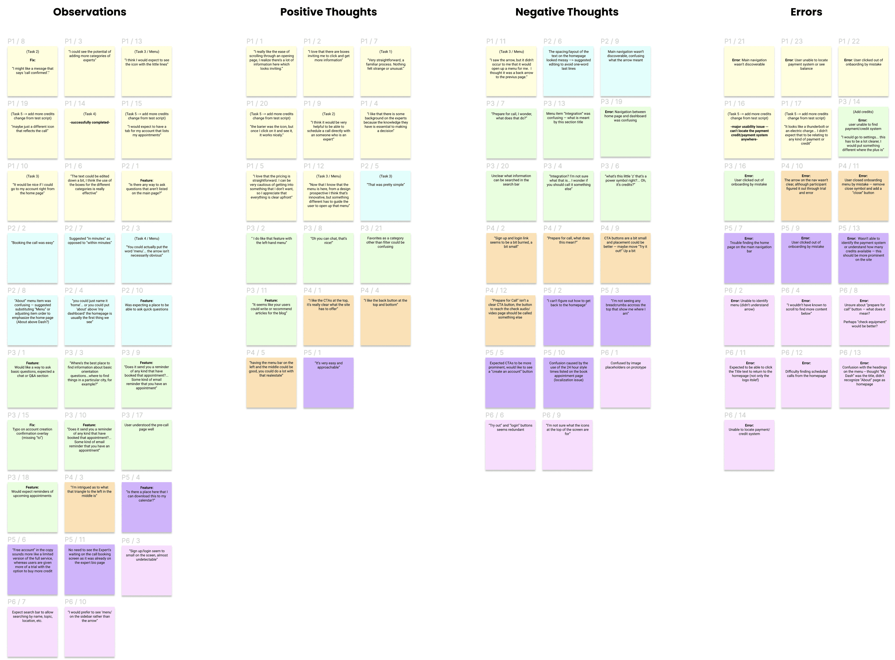

Organizing Findings
Finally, I organized the key observations and errors into a Rainbow Spreadsheet for better visualization. I ranked each issue using the Nielsen severity rating scale and included my suggestions for resolving errors and implementing functionality.
Test Report
A number of issues were observed and recorded during testing, the most significant of which are detailed here, along with the steps taken to resolve them.

Updated Prototype
I focused on 5 key issues and made changes to the prototype for further testing. Unfortunately, the project timeframe didn't allow for additional iteration, but I would have liked to run some more tests to evaluate the changes before moving onto the UI design.

Refining the Design
During this phase I developed and refined the visual design of the app, established a design language for project and wrote a style guide to ensure continuity in future iterations. I began by strategizing how to engage my users. Next I refined my mid-fidelity wireframes into a high-fidelity prototype, applying basic core principles of visual design and building a component library. I carefully documented the intended implementation of design elements in a style guide. I went through several iterations of the high-fidelity wireframes before sharing my work with some peers and wrapping up the design with some final adjustments based on their suggestions.

Strategies for User Engagement
On entering the site, users should feel excited to learn more about their new country and confident that their questions will soon be answered. They should encounter no friction in completing each task, and leave satisfied they have achieved their goals, and certain they will return the next time they need help. To this end, the design is aimed at evoking a sense of adventure, experience, and reliability, achieved through strategic use of color, layout, and language across the user experience.
Strategic Use of Color (visceral level)
Color is an especially important aspect of visual design and plays a significant role in how the user feels about the product. Green is often associated with nature, stability and prosperity, while blue radiates calm and reliability. The main accent color 00BFA0 is a bluish-green that evokes the natural environment, oceans, forests, and rivers, and is meant to associate with travel and adventure, as well as instill a sense of serenity and trustworthiness. The careful use of color with large amounts of whitespace is designed to eliminate distractions and draw the user’s focus to the site’s content, allowing the photography and writing to shine.
Intuitive UI Elements (behavioral level)
The overall user experience is heavily influenced by how intuitive the interface is. The design aims to provide users with the visual cues they need to quickly identify and understand the function of every element on the page. This is achieved by various means of emphasis including shadows and font weights. The main navigation is positioned on the left side of the screen rather than the top or bottom, saving screen space and being easily reachable with one hand at any location within the site.
Strategic Use of Language (reflective level)
It is important that users feel welcomed, understood, and supported during their journey. On leaving the site, they should feel a sense of satisfaction and clarity, and want to return for future assistance. This is achieved through careful choice of language on the site, with emphasis placed on developing a personality that is engaging, personable, and empathetic. Users should feel they are interacting with a friendly, trusted advisor who has been in their shoes.
Visual Design Principles
The first iteration of the app’s visual design is founded in several basic design principles. It aims to present the user with a simple but elegant UI free of distractions that allows the site’s content to shine.
Law of Proximity
Related elements are grouped together, allowing users to recognize and identify sections and easily find the information they are looking for.
Law of Good Continuation
The visual design is consistent throughout the rows and columns of related content, providing a sense of unity, while highlighting the individual purpose of each element.
Law of Hierarchy
Text of different weights establishes a visual hierarchy, allowing users to quickly recognize titles, section headings, and body paragraphs.
Law of Similarity
Sections are designed with similar layouts to reduce cognitive load for new users. Once a user understands how one section works, they will be able to navigate the rest as well.
Law of Emphasis
Elements that open when clicked (such as cards) are highlighted with shadow. The accent color is used on the main Call to Action button on the home page for emphasis, as well as on the menu to indicate the user’s curent location.
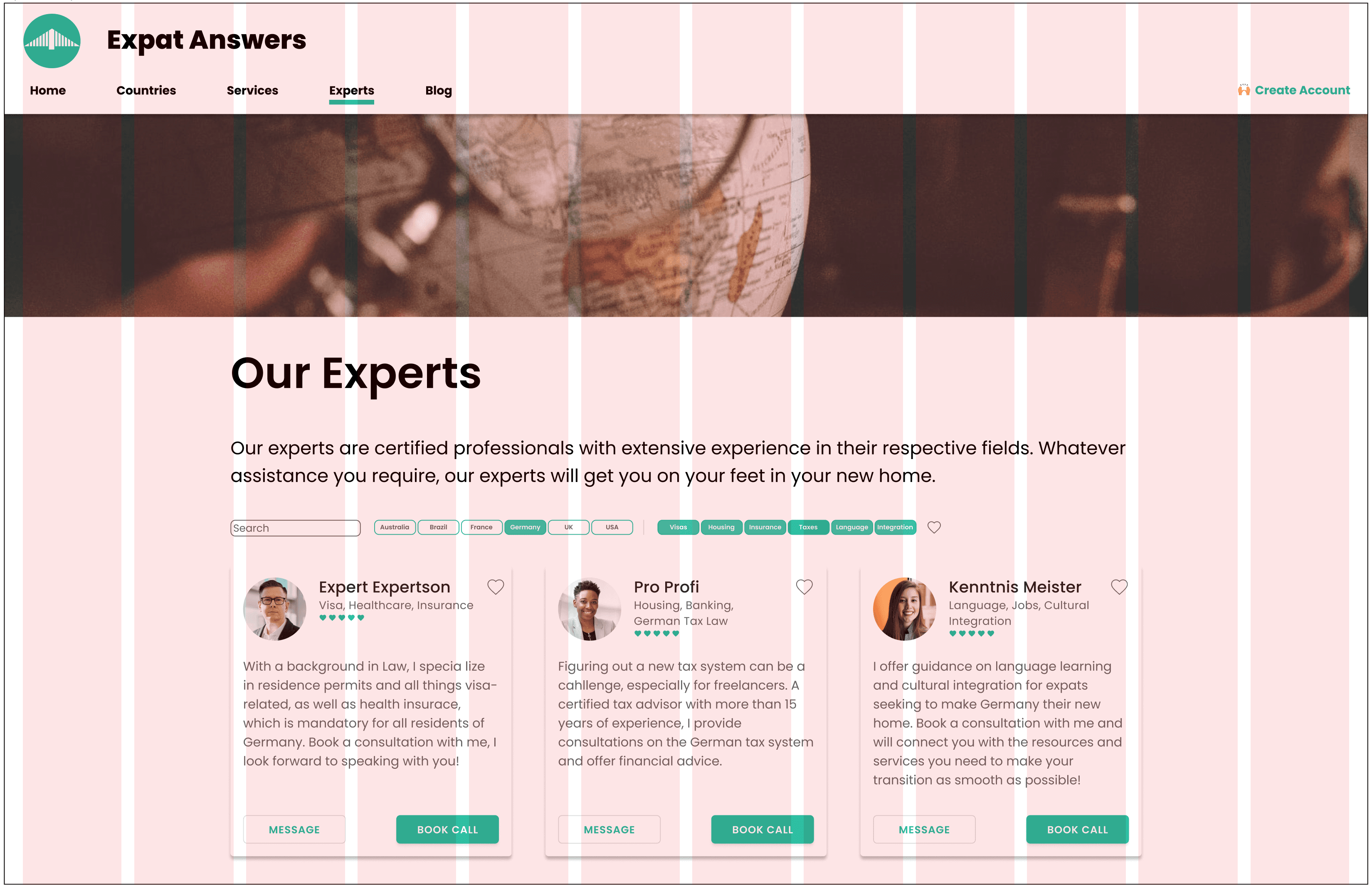
Responsive Design
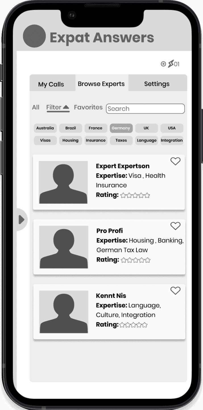
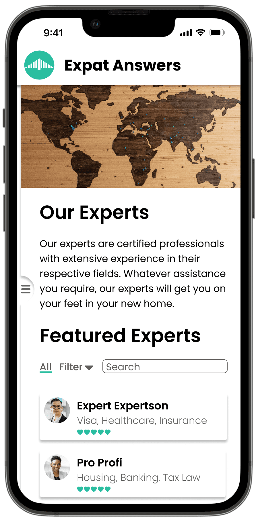
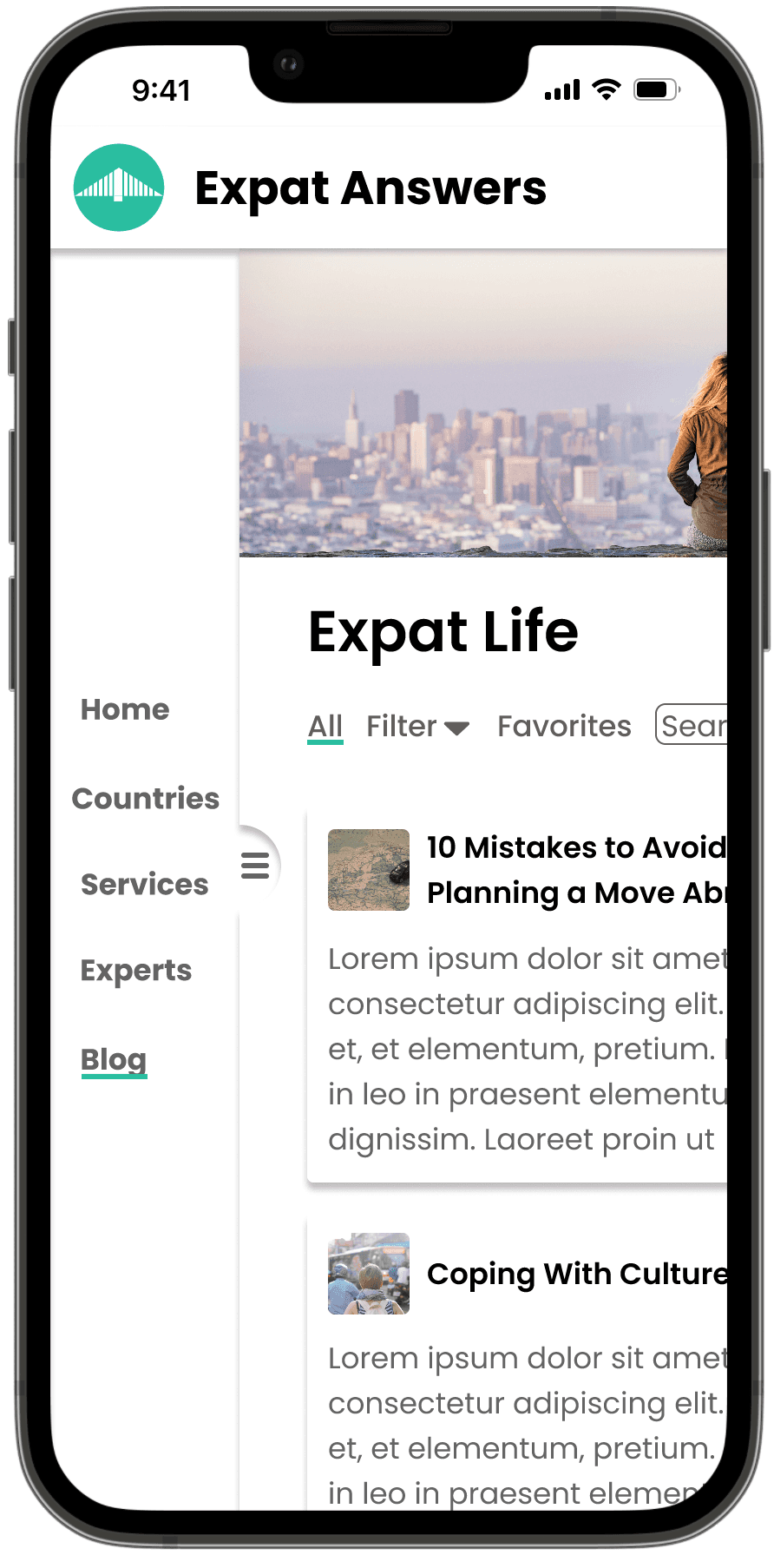
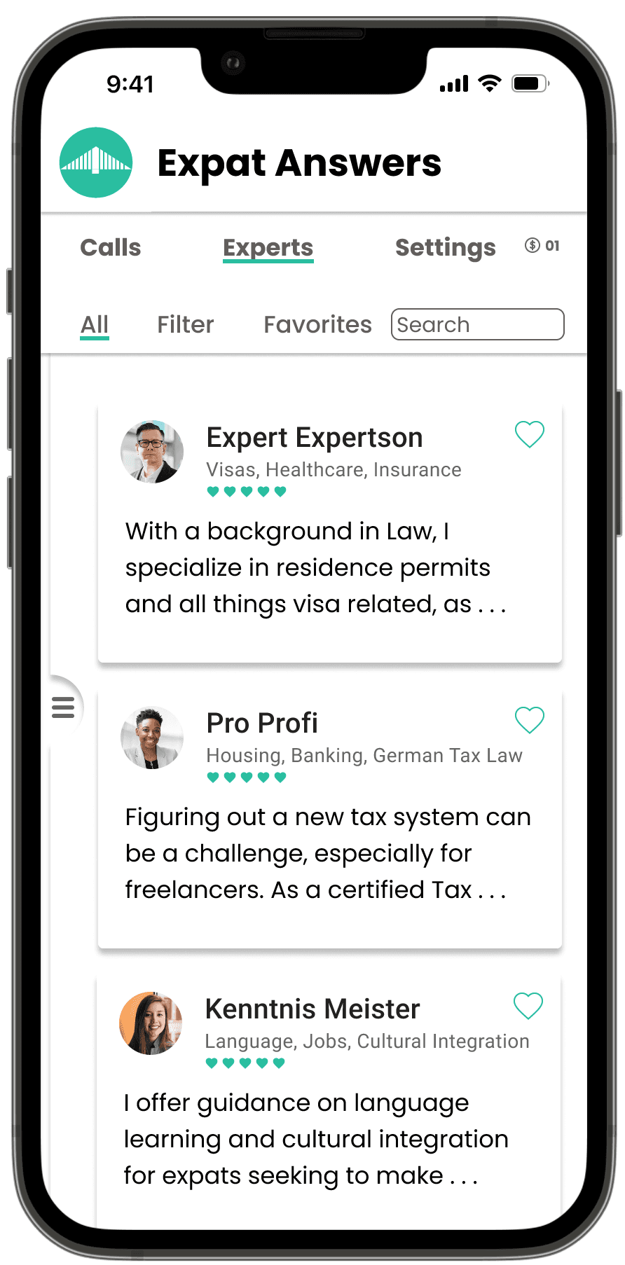
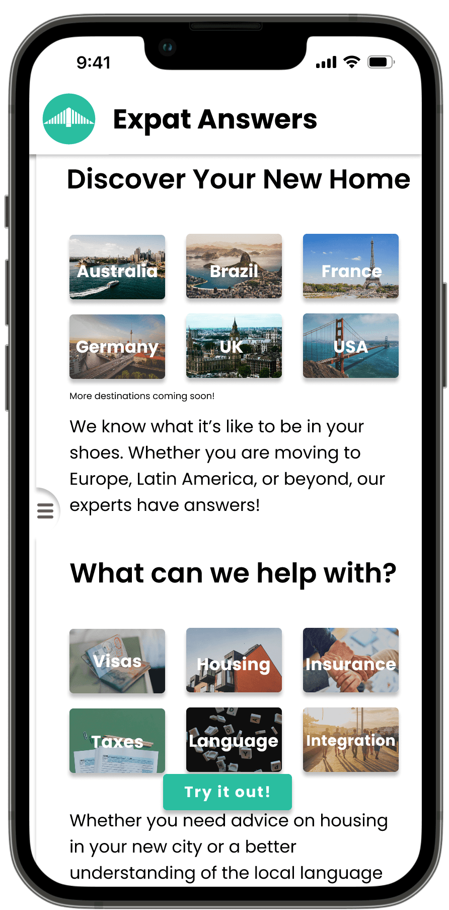
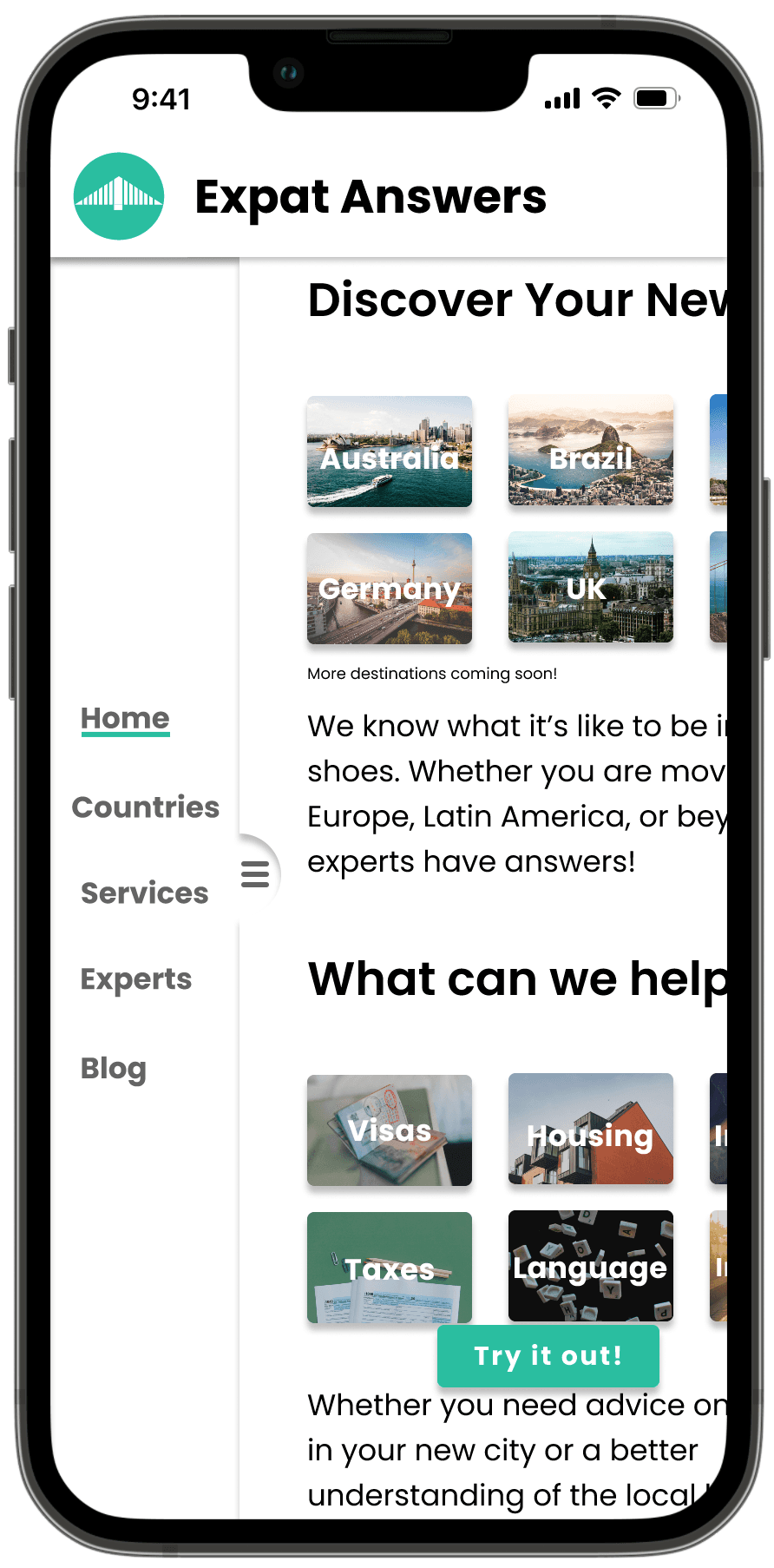
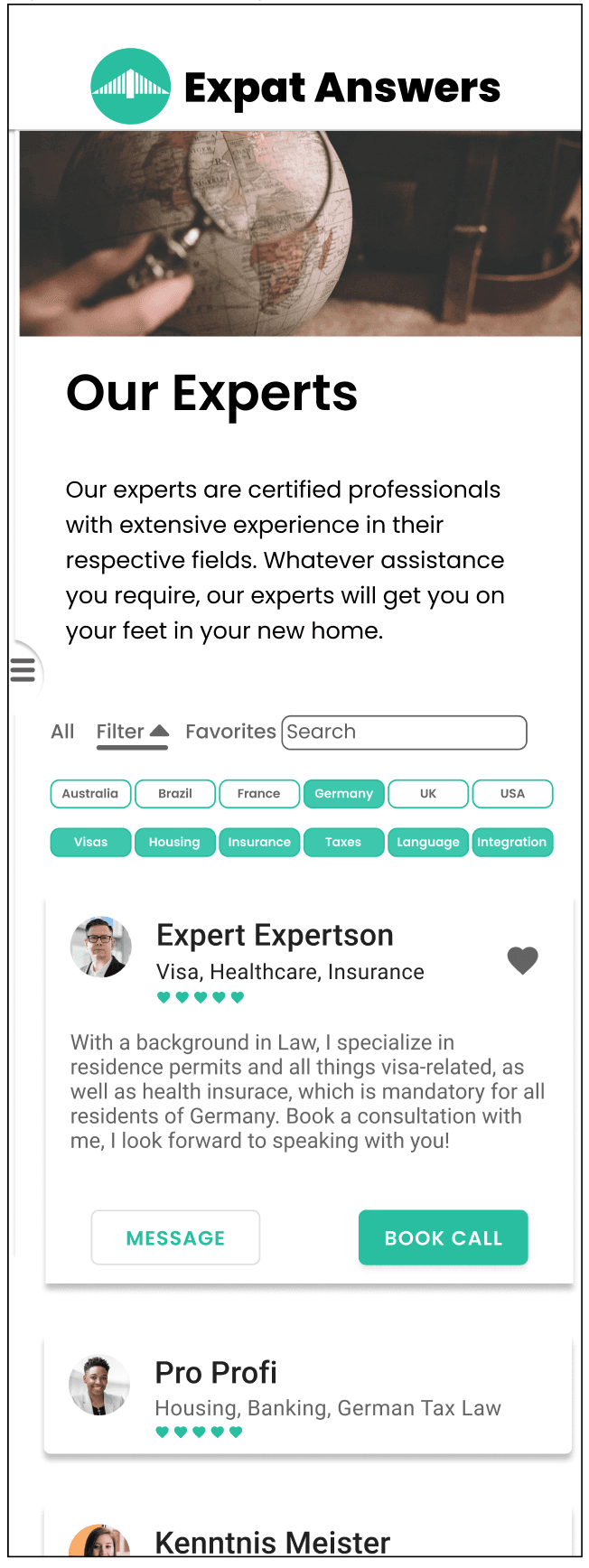
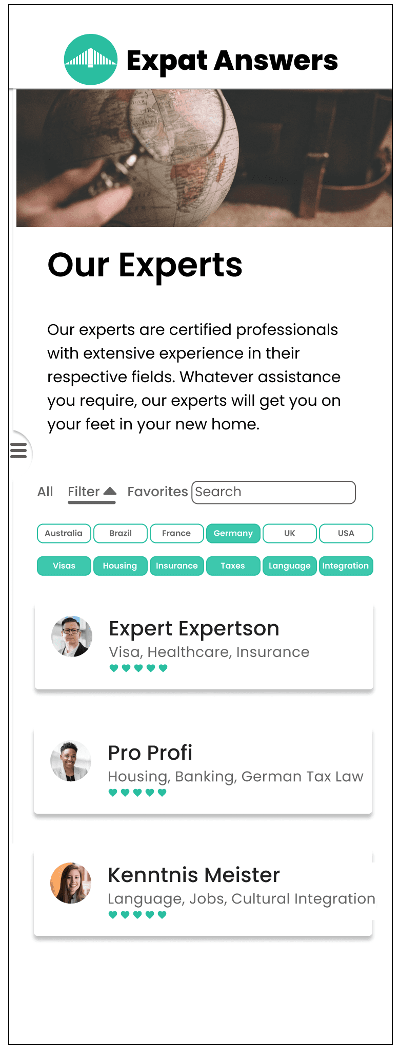
While the focus of the project is mobile first, Expat Answers is intended to be a fully responsive web app, meaning that the experience on desktop should take advantage of additional screen space. This model shows the Experts section on the website in both mobile and desktop versions. The screens are designed around four and twelve-column grids for the mobile and desktop versions respectively.
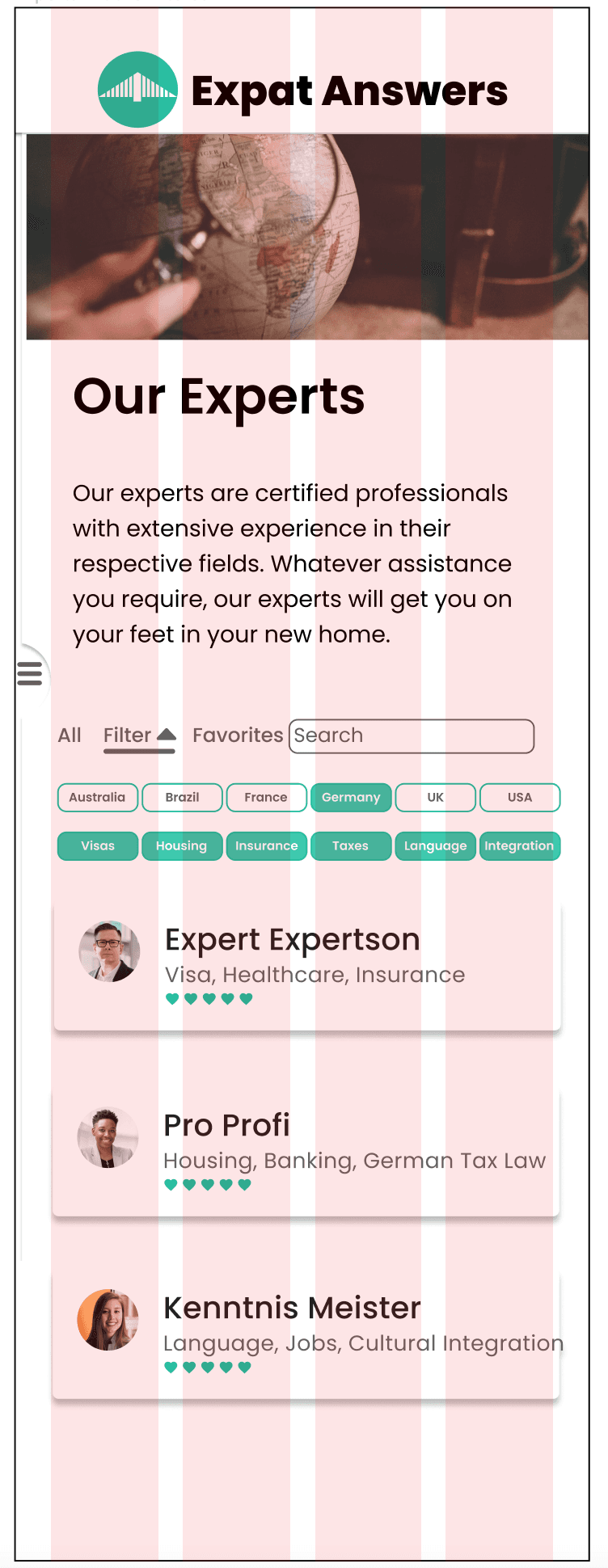
The mobile version saves space by hiding the menu in a nav drawer on the left and allowing filtering options to be toggled on and off. Cards feature a preview of each expert and expand on tap to reveal the full expert bio.
The desktop version utilizes the additional space to provide users with a constant overview of the current location on the site via a top horizontal menu, and filtering options remain visible above the expert list for quick access. Expert cards show the full bio and call to action buttons.

Style Guide
Brand
Expat Answers is an expats first stop abroad, providing expert advice that gives them the peace of mind to enjoy their next adventure. It is friendly as well as practical and emphasizes simplicity, elegance, and reliability in its design language.
Typography
A text hierarchy is established through use of font sizes and color, larger and black text being emphasized over smaller and grey text. Strategic use of whitespace allows for a clean aesthetic and draws focus to the site’s content.
Color
The Secondary color 00BFA0 is a bluish-green that evokes the natural environment, oceans, forests, and rivers, and is meant to associate with travel and adventure, as well as instill a sense of serenity and trustworthiness. The careful use of color with plenty of whitespace is designed to eliminate distractions and draw the user’s focus to the site’s content, allowing the photography and writing to shine.

UI Elements
The overall user experience is heavily influenced by how intuitive the interface is. The design aims to provide users with the visual cues they need to quickly identify and understand the function of every element on the page. This is achieved by various means of emphasis including shadows and font weights. The main navigation is positioned on the left side of the screen rather than the top or bottom, saving screen space and being easily reachable with one hand at any location within the site.
Buttons and Chips
Buttons are based on Material Design. Emphasis is established with color, the primary green accent color signifying greater emphasis and red indicating destructive action. Buttons have a corner radius of 4px, while choice chips are distinguished by their smaller text and corner radius of 8px.

Fields
Search bars and short text entry fields have a corner radius of 4px and flexible length, adjusting to fill the line when placed adjacent to other components such as tab bars such as the Expert page tabs (right).

Navigation
Tabs are used in the main site navigation as well as the dashboard. Large tabs are used for the main navigation on the desktop version, while small ones are used for smaller screen sizes. The mobile version features a side nav drawer to save space, allowing for easier access than a top navbar, and allowing users to focus on tabs immediately relevant to the dashboard.

Cards
Cards are used with elements meant to be interacted with by the user, indicating either that a click or tap will expand the card revealing more information, or that action can be taken by clicking or tapping on a button on the card. Cards have a drop shadow with a Y value of 4px, a blur of 4px, a spread of 0px, and an opacity of 25%.

Icons
Icons are to be used sparingly to avoid clutter and enhance accessibility. Heart icons are used for the favorite button as well as expert ratings. Filter icons indicate whether a filter is open or closed. Expand and minimize icons are only used to indicate that video calls can be expanded to fullscreen or minimized to a window.

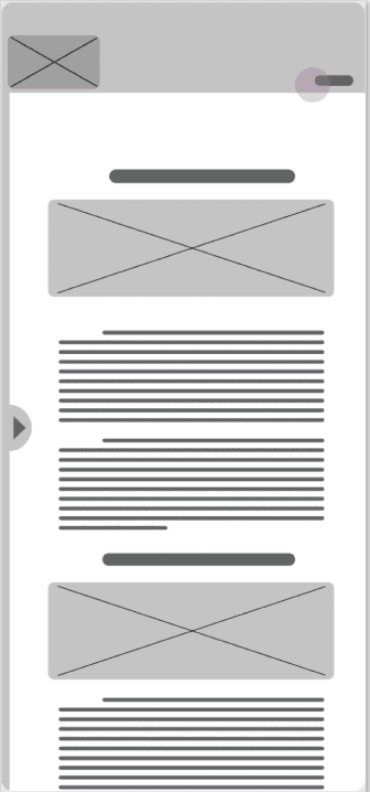
Images
Several important UI components are comprised of images. The Tile Grid is used in the “Countries” and “Services” sections presenting users with clickable cards emphasized with colorful photography leading to the pages of individual countries and services. Large Header Images are employed on second-level informational pages. Blog article preview cards feature a square preview image of the larger one at the top of each article. Profile pictures are circular to distinguish them from other kinds of images on the site.

Photography plays a prominent role in the site’s visual style, as it is emphasized by the minimalist UI elements and ample white space. Expat Answers aims to instill in users a sense of excitement and adventure. Pictures of landmarks, monuments, cityscapes, and natural beauty are a great fit for supporting this goal. Larger less detailed images can be used on text-heavy pages to minimize distraction while adding some color.

Language
Familiar. Understanding. Supportive.
It is imperative that users feel welcomed, understood, and supported during their journey. On leaving the site, they should feel a sense of satisfaction and clarity, and want to return for future assistance. This is achieved through careful choice of language on the site, with emphasis placed on developing a personality that is engaging, personable, and empathetic. Users should feel they are interacting with a friendly, trusted advisor who has been in their shoes.
To keep the focus on content, menu items and UI text should be as simple as possible. One or two words per item wherever possible.
Usage
Static elements should use an outline rather than shadow. Don’t Use shadows or cards for static components that can’t be tapped, clicked, or interacted with.


Use brightly colored images. Use white text on images. Don’t use dark text on images.

Use square thumbnails for blog articles. Use circular images only for profile pictures.

Voice

Evaluating Feedback
Though I didn't have time to conduct more usability tests, I did get the chance to have some peers review my design process. The feedback I received was constructive, and my peers identified several minor issues, such as inactive buttons, misaligned elements and inconsistent shadows which I fixed on the spot. Below I have recorded the most significant further suggestions and documented the changes I’ve made to the prototype as well as my rational for any disagreement I had.

Text Size Adjustment
I received consistent feedback that certain text was too small. I made it larger.
Navbar/Burger Discoverability
Many of my peers suggested that I change the main navigation of the site, preferably, placing the hamburger menu symbol at the top of the screen rather than on the left side.
This wasn’t a problem during my usability testing, as all my participants were able to find the menu relatively quickly, and a few even commented that they appreciated the location. I will leave this feature as is, though, if I had more time to conduct usability tests, I would definitely test a new version of the prototype with a hamburger at the top of the screen.

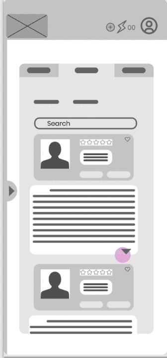
Expert Rating Icons
Another frequent comment was that the heart icons on the expert ratings were confusing, especially as a heart icon is also in use for the “favorite” button. While I don’t believe this to be a serious issue, as it wasn’t mentioned at all during my usability testing, I have created alternative screens that utilize star icons instead. If I had the time, I would run an A/B test to see which version users prefer.


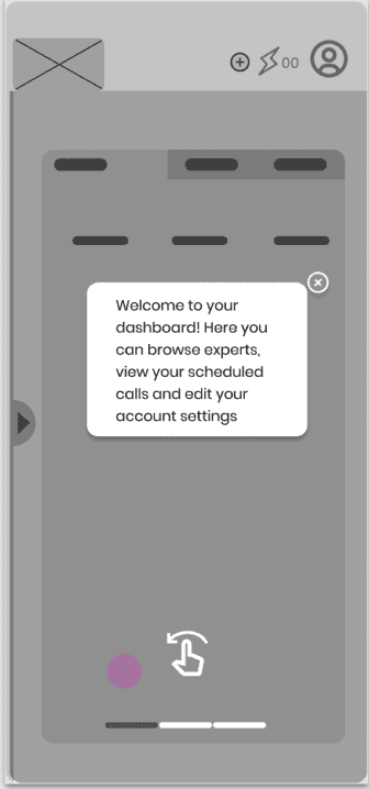
Overlay Window
One of my commenters suggested the the position of the overlay window during onboarding and booking be adjusted to make more content visible behind it. I decided to create an alternate version of the relevant screens which I could test with users.


Choice Chips
Several issues were raised with the choice chips. I was reluctant to stack the rows, as I wanted to use space as efficiently as possible. While I agree that using a drop down or carousel could be useful, and even necessary when more countries are added, I believe that, given the current number of options, hiding them behind an extra click on this screen is unnecessary, and would prefer them to be glanceable.


Misc Suggestions
The text on the image cards could be hard to read for some users: I adjusted the contrast on the images to make the text stand out more.
Before

After

The button could pop up after reading some of the text: This is a good idea, but I’m not sure how to implement it exactly right in Figma. I will be sure to look into this for future use cases.


Learnings and Next Steps
Learnings
Thank you for taking the time to read my case study! I put a lot of love and effort into creating the best possible design solution I could, and I learned a lot along the way. Through numerous iterations of my mid and high-fidelity wireframes, I achieved a comprehensive knowledge of Figma, allowing me to leverage the software to create a high quality interactive clickable prototype built on a well structured component library complete with a style guide on component usage. While Figma is my go-to design software, I also gained familiarity with Framer, Sketch and Adobe XD. This knowledge will enable me to turn my passion for design into even better solutions in the future!
Next Steps
While the further development of Expat Answers was beyond the scope of the case study, there are certainly areas for further improvement. First of all, if I’d had more time, I’d have conducted additional rounds of usability testing to evaluate the updated prototype. I would also have liked to add more features including support for different languages, the ability to rate calls upon completion.